Design Nomenclature / Type

Legibility

How easily individual characters are told apart — a property of the typeface. It is measurable: aperture, x-height, stroke contrast, and distinction between confusable pairs (I/l/1, b/d, O/0, rn/m). A face can be highly legible and still make miserable reading if it is badly set.
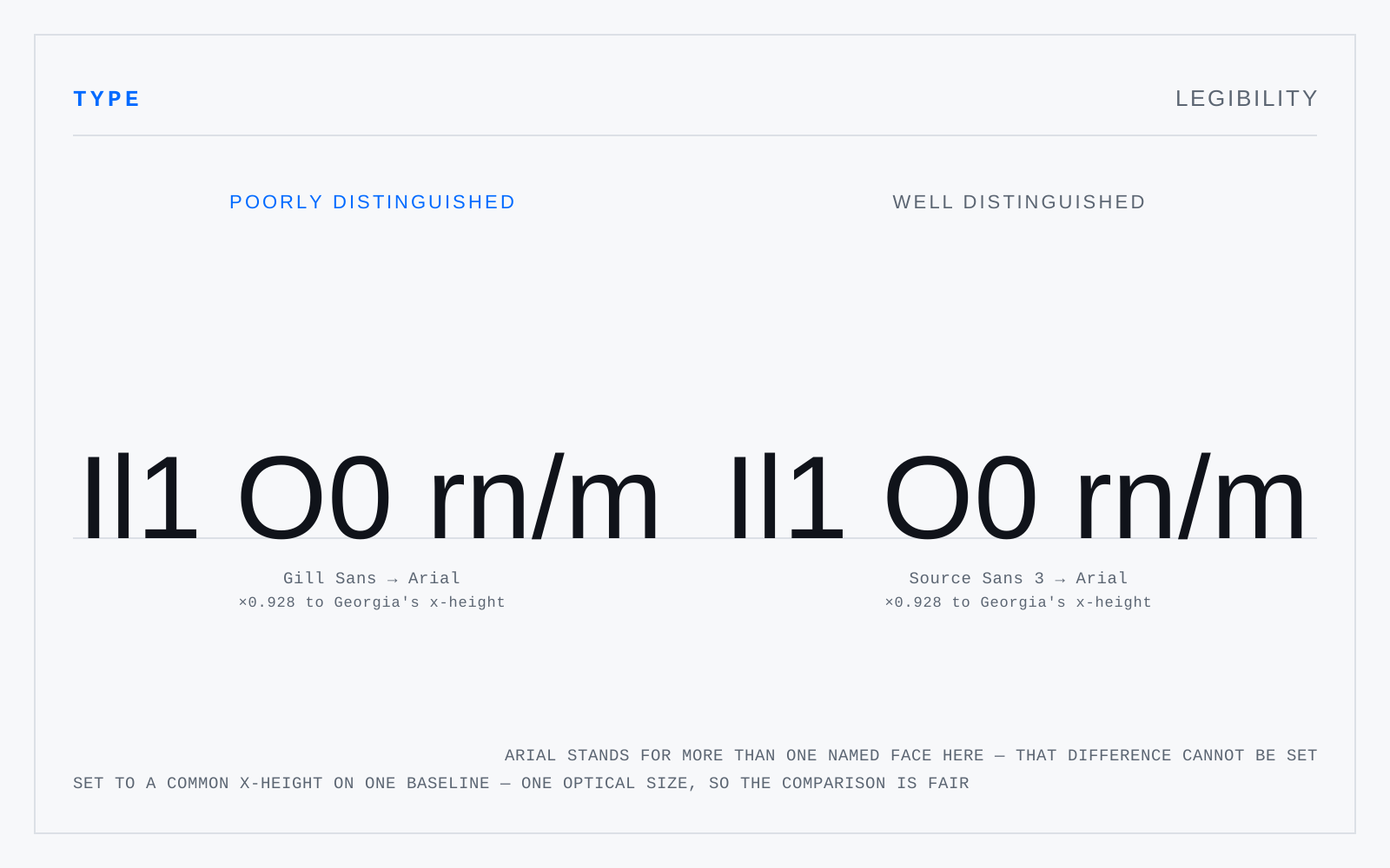
The confusable groups Il1, O0 and rn/m twice on one baseline, headed 'poorly distinguished' and 'well distinguished'. Gill Sans and Source Sans 3 both substitute to Arial — printed under each — so both specimens are the same face, and a footnote says the difference cannot be set here. What the figure does show is Arial's own Il1: three strokes a reader must tell apart on width alone.

In practice

Not interchangeable with readability, though the trade uses them so. The distinction is worth holding because it separates what you fix by choosing a face from what you fix by setting it.

Not to be confused with

How this term connects

ApertureBlackletterBoumaCounterHumanist sansNeo-grotesqueReadabilityX-heightLegibility
Related Confused with