Design Nomenclature / Type
Aperture
- Type
- 2D
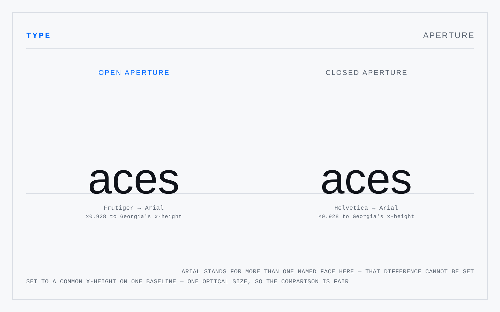
The opening through which a partly enclosed counter connects to the space around the letter — the gap between the terminals of c and s, the mouth of a, e and the top of n. Open apertures keep c distinct from o and e from a under blur and at small sizes; closed, folded-in apertures lose those distinctions first.
In practice
The measurable half of "legible typeface" marketing. When a face is sold as accessible, the aperture and the Il1 test are what to check before the claim.