Design Nomenclature / Type
Grotesque
Also called grotesk, gothic
- Type
- 2D
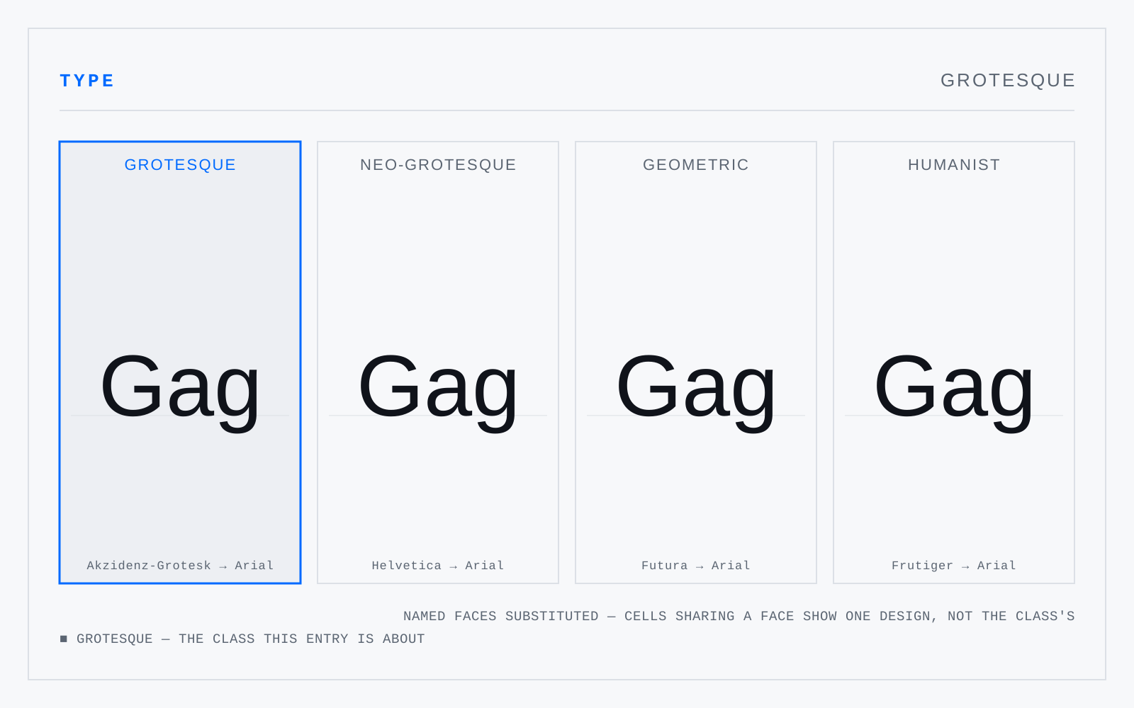
The nineteenth-century sans serifs — Akzidenz-Grotesk, Franklin Gothic, News Gothic. Slight irregularity between letters, a squarish rather than circular bowl, closed apertures, a spurred G, and a lowercase g that is usually single-storey with an open tail. Warmer and less systematic than what followed.
Not to be confused with
Origin
An insult that stuck. The first sans serifs struck readers as barbarous — grotesque in the sense of the grotto-frescoes, meaning bizarre. American foundries called them Gothic instead, equally inaccurately.