Design Nomenclature / Type
Readability
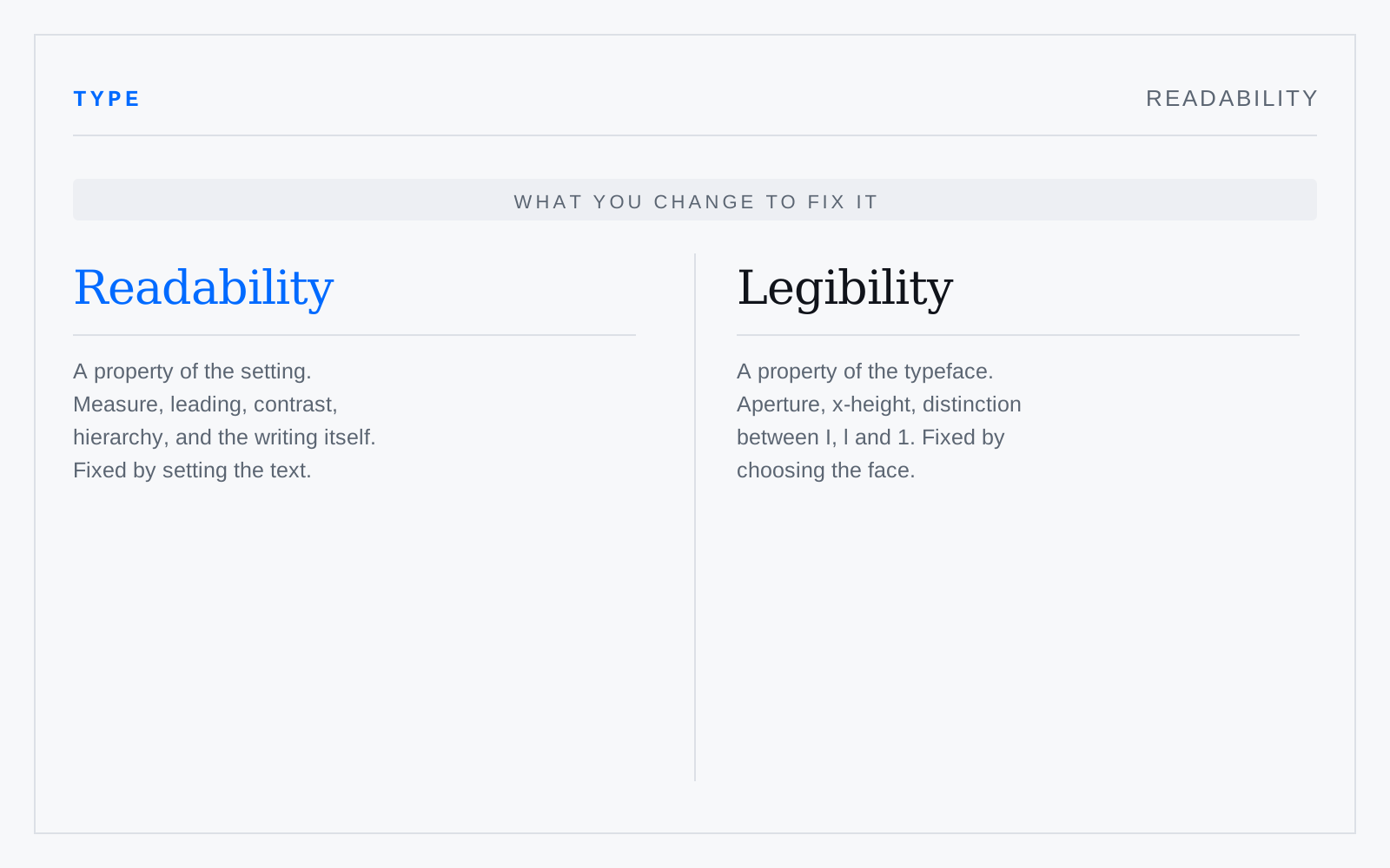
How easily a reader gets through extended text — a property of the setting and the writing, not the face. Measure, leading, contrast, alignment, hierarchy and sentence construction all bear on it. A perfectly legible face at a 120-character measure with tight leading is unreadable, and the face is not the problem.
In practice
Readability scores — Flesch, Gunning fog — measure sentence and word length and nothing else. They are proxies, not the thing; they will happily rate a well-written technical paragraph as unreadable.