Design Nomenclature / Type
X-height
Also called corpus size
- Type
- 2D
The height of the lowercase x — flat-topped and flat-bottomed, so it measures cleanly — taken from the baseline to the mean line. It is the best single predictor of how large a face reads at a given point size, and the ratio of x-height to cap height largely sets a face's apparent scale and small-size legibility.
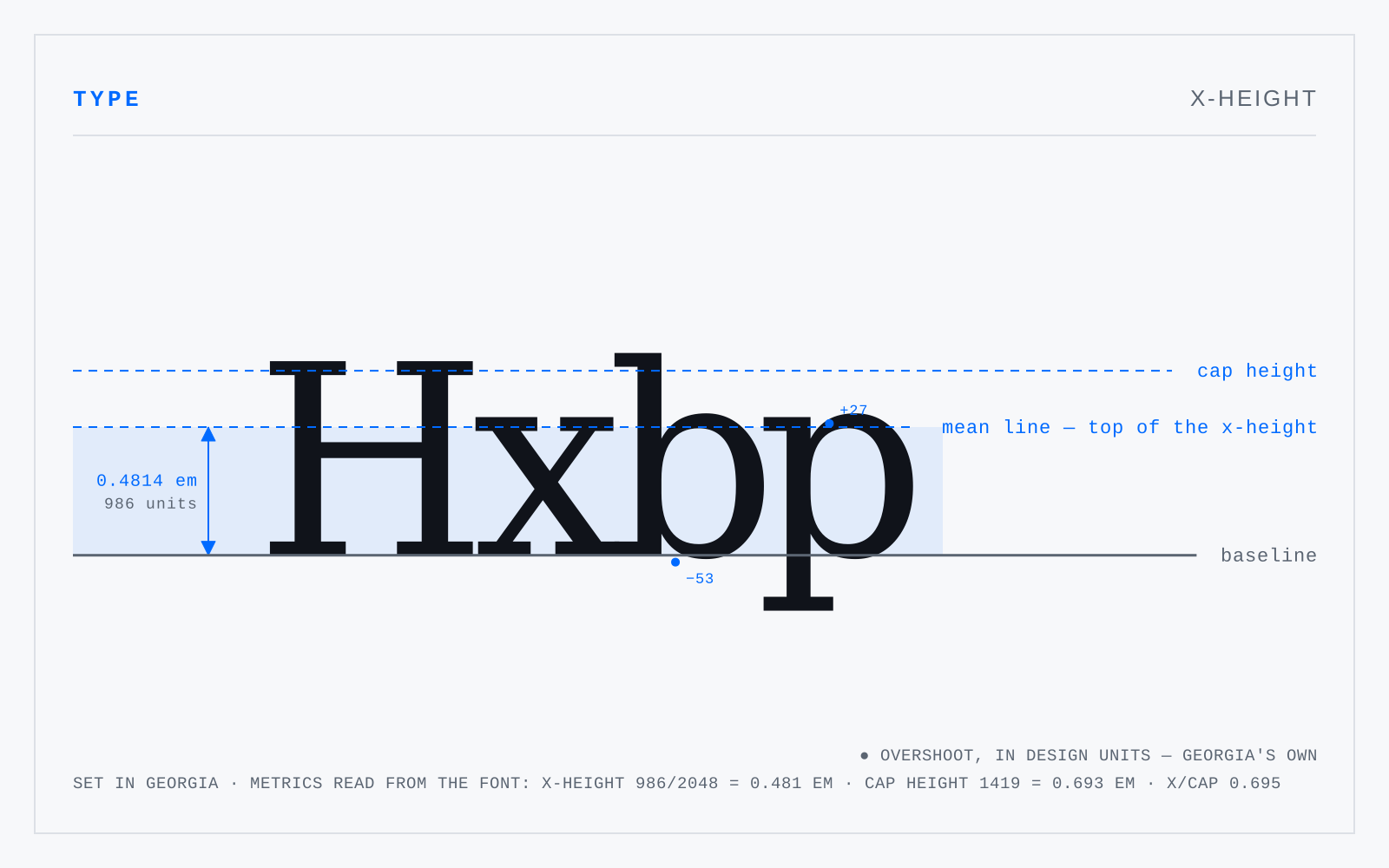
In practice
Two faces at the same font-size can differ by a third in apparent size. That gap, not the point size, is what readers see; font-size-adjust exists to close it across fallbacks.
Not to be confused with
- Cap heightThe distance from the baseline to the top of a flat-topped capital such as H or E. Round capitals like O and S overshoot it slightly. In most Latin faces the cap height sits a little below the ascender line, which is why a lowercase l typically rises above an adjacent H.
- PointThe unit of type size, standardised as exactly 1/72 inch by PostScript and every application since. Historically it was never one thing: the Anglo-American point ran near 1/72.27 inch, the Didot point near 0.376 mm, Fournier's smaller again — which is why old specimens don't convert cleanly to anything.