Design Nomenclature / Color
Contrast of extension
Also called contrast of proportion, area contrast, quantity contrast
- Color
- Composition
- 2D & 3D
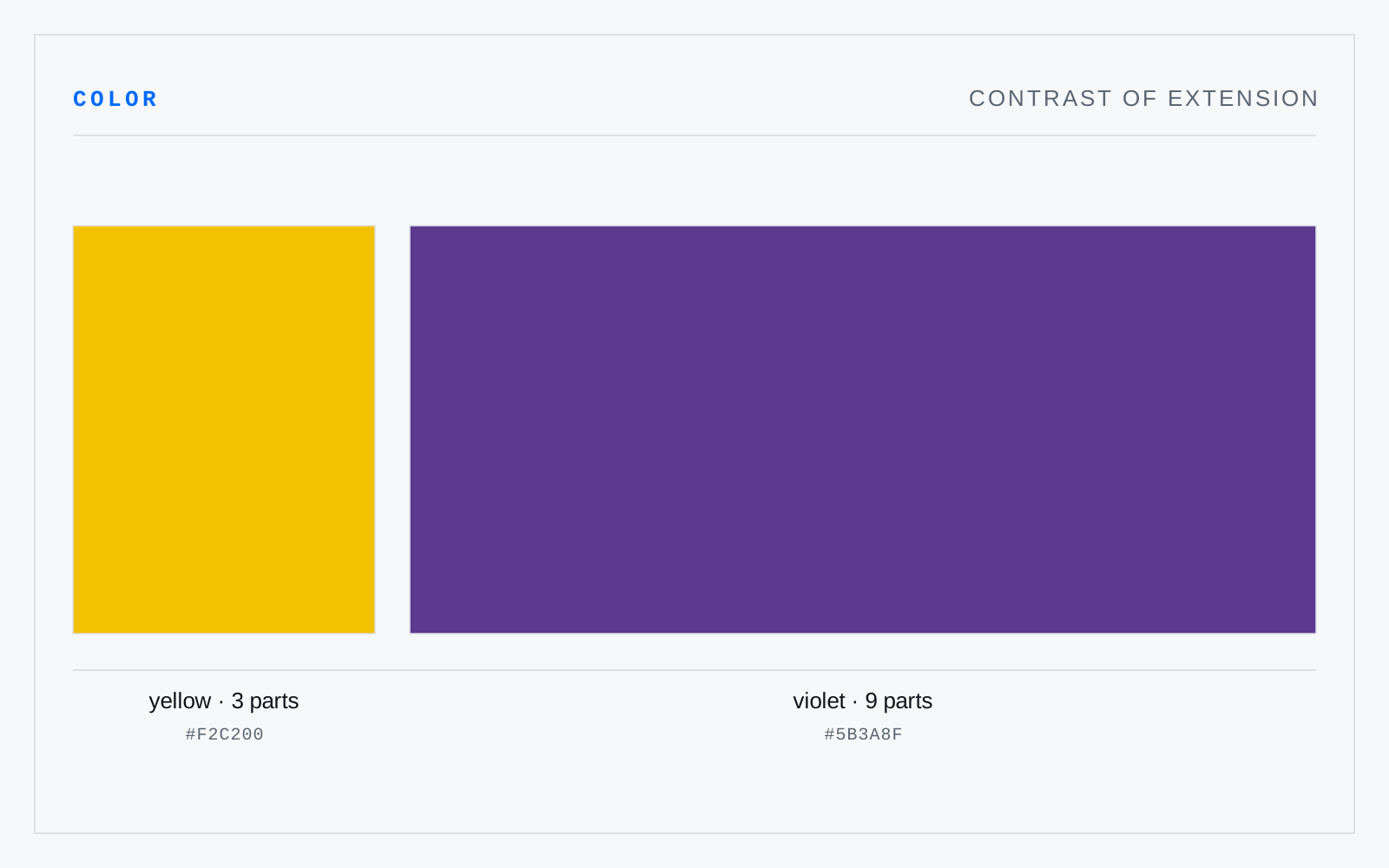
Difference in the area two colors occupy. Itten took Goethe's light values — yellow 9, orange 8, red 6, green 6, blue 4, violet 3 — and inverted them: to balance, a color wants area in inverse proportion to its brightness, so violet needs roughly three times the field that yellow does.
In practice
'Balance' here means neither color dominating. Plenty of good work unbalances it deliberately — a small saturated field against a large dull one is exactly how an accent works.