Design Nomenclature / Color
Chroma
Also called colorfulness, intensity
- Color
- 2D & 3D
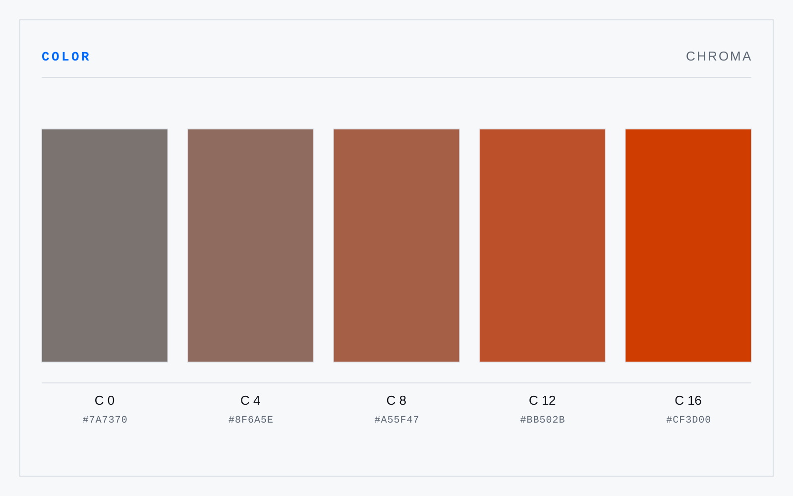
The strength of a color measured against a neutral grey of the same value — how far it sits from the achromatic axis. Chroma is an absolute distance, so its ceiling is not uniform: it varies with hue and with value, which is why a Munsell chroma of 10 is near-maximal for a blue-green and unremarkable for a red.
In practice
Designers say 'saturation' for what Munsell, CIELAB, and OKLCh all call chroma. Not interchangeable: saturation is chroma judged relative to value.
Not to be confused with
- SaturationChroma judged relative to the color's own brightness — how vivid it appears given how light it is. Being a ratio rather than a distance, saturation holds roughly constant down a shadow gradient where chroma falls: a red wall in shade loses chroma but keeps saturation, which is why it still reads as the same red.
- ValueHow light or dark a color is, independent of hue and chroma — the one attribute that survives conversion to greyscale. Value does the structural work: legibility, depth, and figure-ground separation all rest on value difference far more than on hue difference, and a composition that fails in greyscale was leaning on hue to hide it.
Origin
Greek khrōma, 'color'. Munsell narrowed it to mean strength of color specifically, and every space descended from his kept the narrowed sense.