Design Nomenclature / Color
Color harmony
Also called colour harmony, color scheme, colour scheme, palette theory
- Color
- Composition
- 2D & 3D
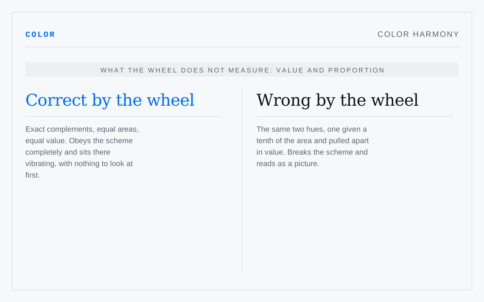
The doctrine that certain hue relations are inherently agreeable, read off fixed angles on a wheel: complementary, analogous, triadic, tetradic. The relations are real geometry. The pleasure they are said to guarantee is not — value and proportion decide whether a palette works, and the wheel knows about neither.
In practice
Every scheme on the wheel can be made to look terrible, and every palette that works can be reverse-engineered into one afterwards. Useful for generating candidates, useless for judging them. Composition's harmony is a different word about relation between parts, and shares no method with this.