Design Nomenclature / Color
White point
Also called reference white, illuminant, D65, D50
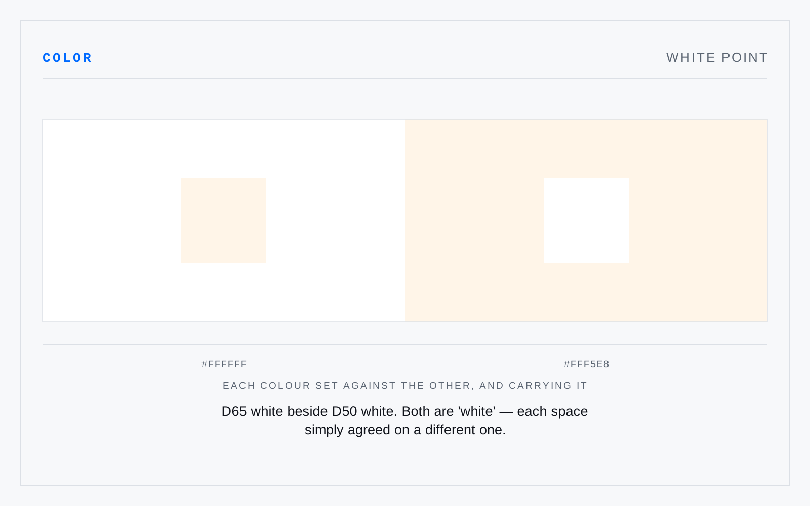
The chromaticity a space agrees to call neutral: D65 for sRGB and Display P3, D50 for print and ICC's profile connection space. It is a choice rather than a measurement of anything absolute, and mismatching it is how images pick up a cast on the way from screen to press.
In practice
D65 is roughly overcast daylight, D50 warmer. The 6500K and 5000K labels name a correlated color temperature — shorthand for the chromaticity, not the whole of it.
Not to be confused with
- Color temperatureThe temperature of a blackbody radiator whose color matches the light in question, given in kelvin. It runs backwards from intuition: 2700K is warm orange, 6500K cool blue. Only sources near the Planckian locus have a true color temperature; LEDs and fluorescents get a correlated one, which hides any green or magenta tint the number never reports.
- Chromatic adaptationThe visual system rescaling its cone responses to the prevailing illuminant, so a white shirt reads white under tungsten and under noon daylight despite radiating quite different spectra. Cameras approximate it as white balance; color management models it with transforms — Bradford, CAT16 — whenever a value crosses between white points.