Design Nomenclature / Type
Transitional
Also called réale, neoclassical
- Type
- 2D
Mid-eighteenth-century romans between the garaldes and the didones — Baskerville, Fournier, Bulmer, and the Romain du Roi ahead of them. Stress swings to near-vertical, contrast rises, serifs sharpen and flatten, and the whole design starts to be drawn to a grid rather than derived from a pen.
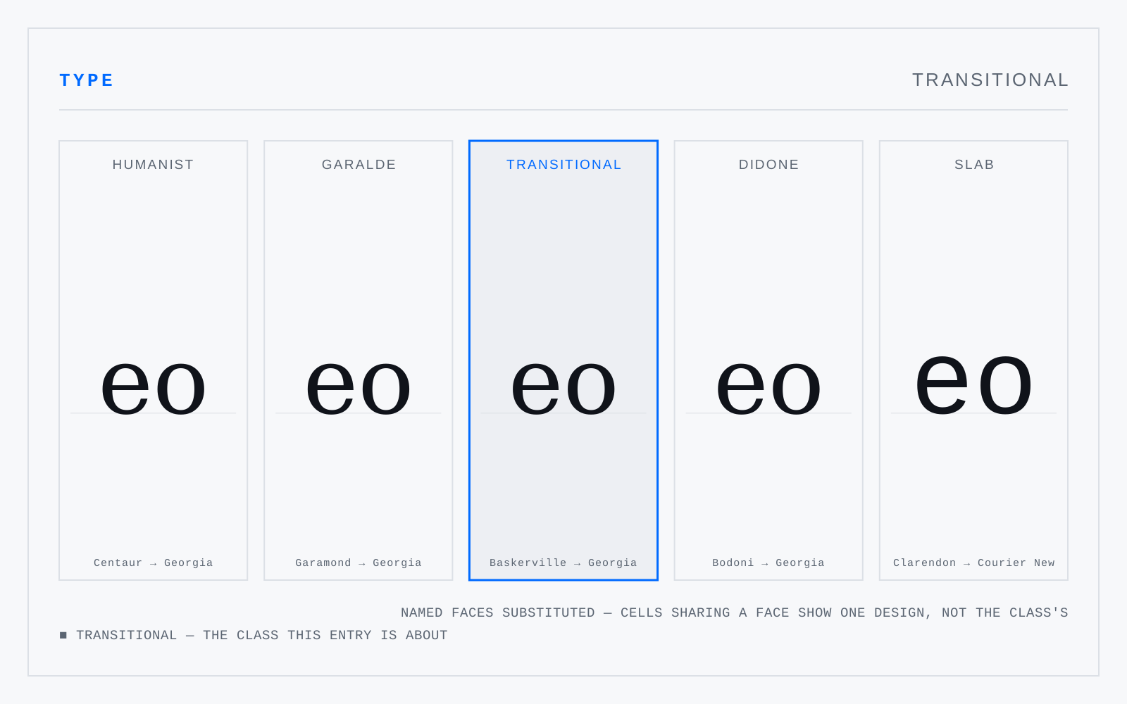
In practice
The name presumes the didones were the destination, which is teleology, not description. It is entrenched enough to keep using; just don't let it imply Baskerville was aiming at Bodoni.
Not to be confused with
- GaraldeThe dominant text roman from roughly 1500 to 1750 — Bembo, Garamond, Granjon, Caslon. Compared to the humanists: more stroke contrast, a level bar on the e, finer bracketed serifs, and stress still inclined but less so. Caslon and Janson sit at its late edge, already reaching toward the transitionals.
- DidoneThe high-contrast romans of around 1800 — Bodoni, Didot, Walbaum. Exactly vertical stress, abrupt and extreme thick-to-thin, unbracketed hairline serifs meeting the stem at a right angle, ball terminals, tight fitting. Cut for smooth paper and precise presses; on anything coarser, or any low-density screen, the hairlines vanish.