Design Nomenclature / Type

Width

Also called wdth, font-stretch, condensed, extended

How much horizontal space a face's letters occupy, as a percentage of normal — the wdth axis, exposed in CSS as font-stretch or font-width. A drawn condensed narrows the counters and keeps the stems; horizontal scaling narrows both, which destroys the stress and the weight relationship at once.
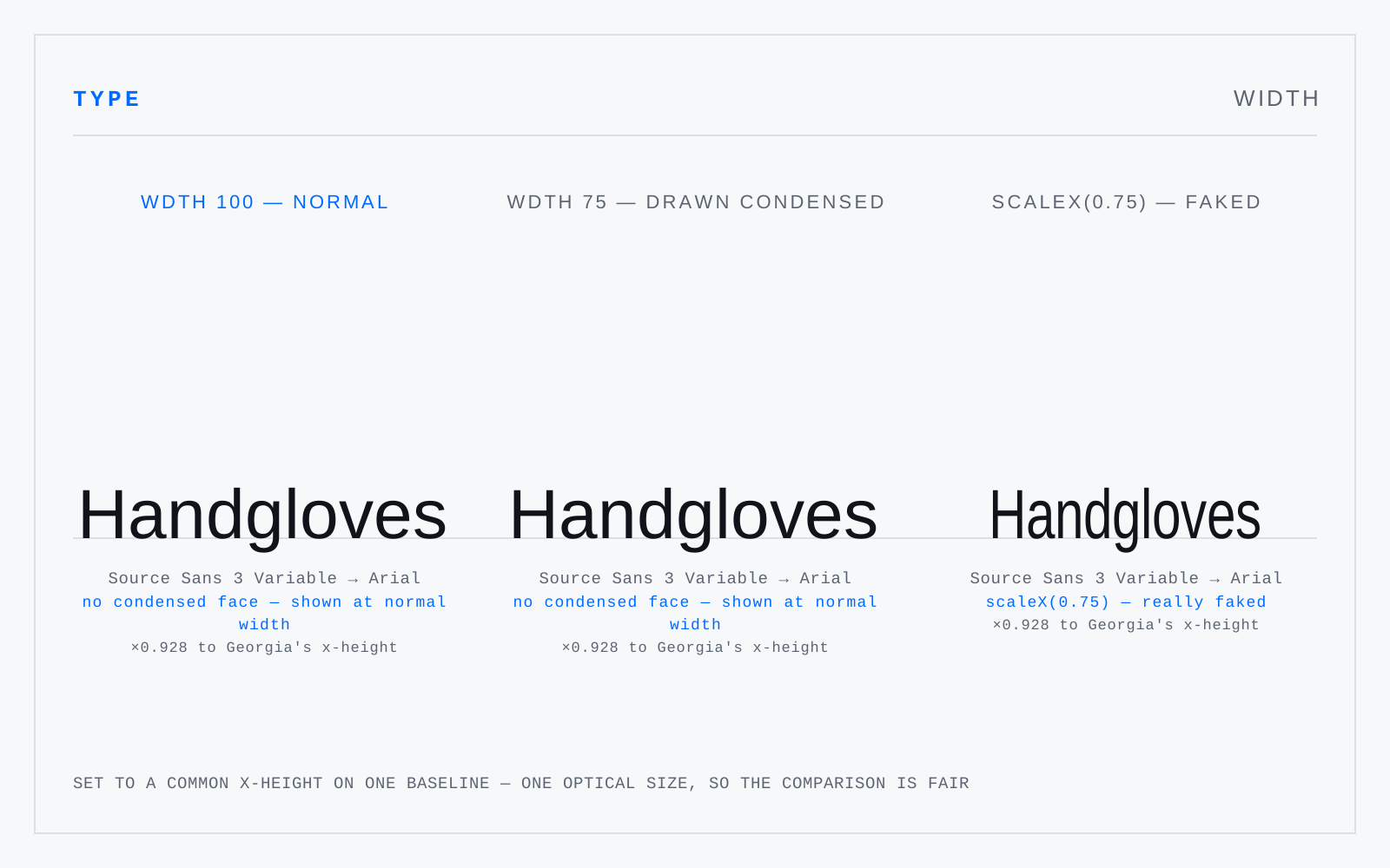
The word 'Handgloves' three times on one baseline, headed wdth 100 normal, wdth 75 drawn condensed, and scaleX(0.75) faked. Source Sans 3 Variable substitutes to Arial, printed under each. Arial has no width axis, so the first two carry a note saying there is no condensed face and are shown at normal width — identical. Only the third is really narrowed: scaleX(0.75) applied to the same setting, its uprights visibly thinned while its horizontals hold, which is the entry's point and the one thing here that is not stood in.

In practice

Never fake it. A transform: scaleX() or a squashed placement in the layout program produces letterforms no designer drew, and the tell is that the verticals go thin while the horizontals don't.

Not to be confused with

How this term connects

CounterGeometric sansMeasureNeo-grotesqueTypefaceVariable fontWeightWidth
Related Confused with