Design Nomenclature / Type
Optical spacing
Also called optical kerning, fitting
- Type
- 2D
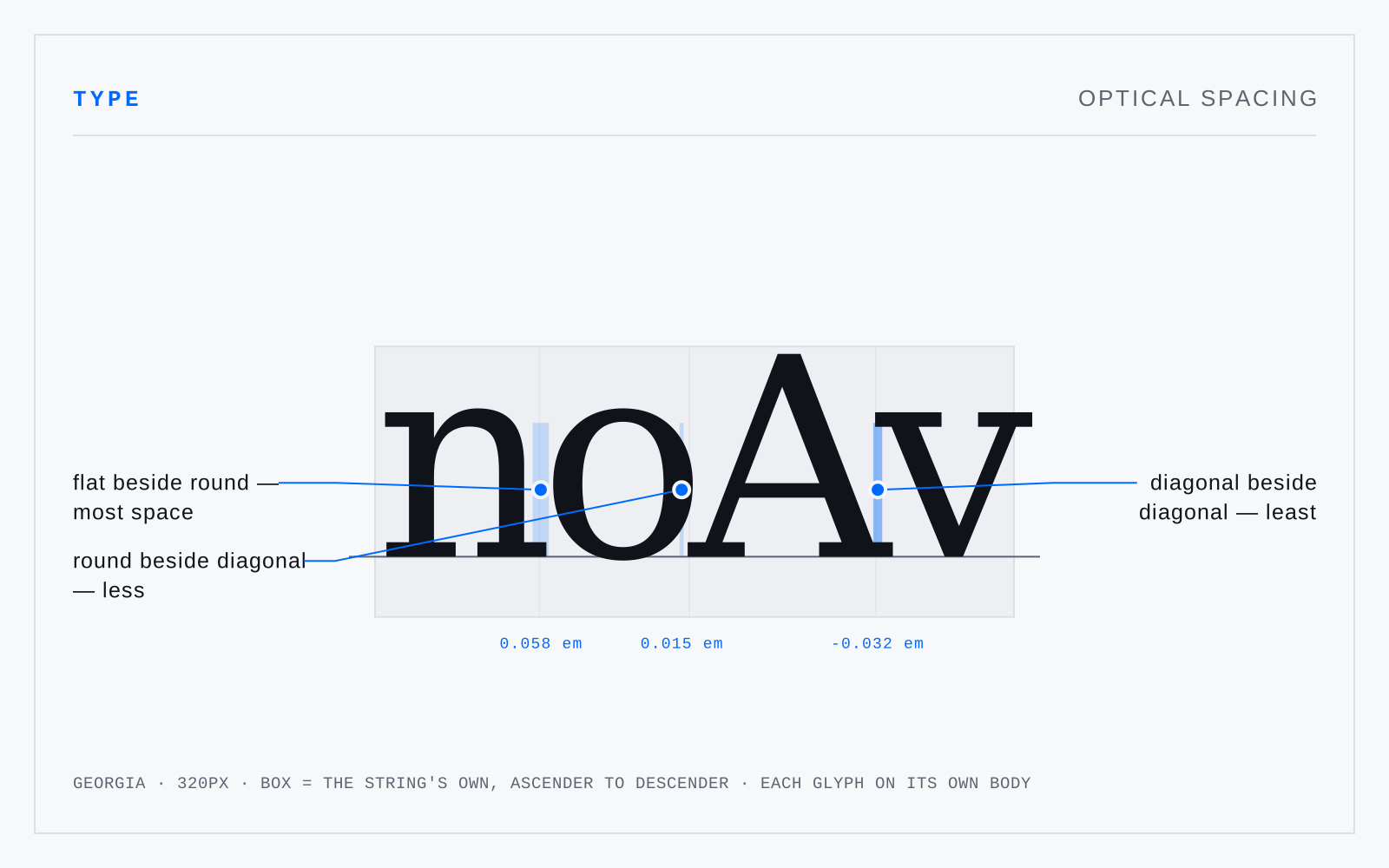
Fitting letters so the white between them looks even rather than measures even — a straight-sided n takes more space beside it than a round o, which takes more than a diagonal A. The principle behind a type designer's sidebearings, and behind InDesign's Optical kerning, which derives spacing from outlines instead of the font's kern pairs.
In practice
Optical kerning overrides a good font's own pairs, which are usually better. It earns its keep on faces with poor or absent kerning data, and on mixed-face runs where no pairs exist.